okoora branding
For a fintech startup, that helps entrepreneurs deal with multiple currencies, I designed a logo and a graphic language, based on a strategy developed by Dave Shamir. The project is owned by the Firma agency.
Logo
The three shapes symbolize market fluctuations, while an overall upward direction is indicative of progress and growth.
The center element, being the biggest, anchors the composition, and offers Okoora as a go-to tool of every business.
Concept
Okoora is a digital solution, that provides a birds-eye view of the multiple currencies.
It is a tool that leverages the collective knowledge of a thousand of brokers and advisors in its algorithms.
It is guided by a single principle: to simplify the complexities of currency management.
Language
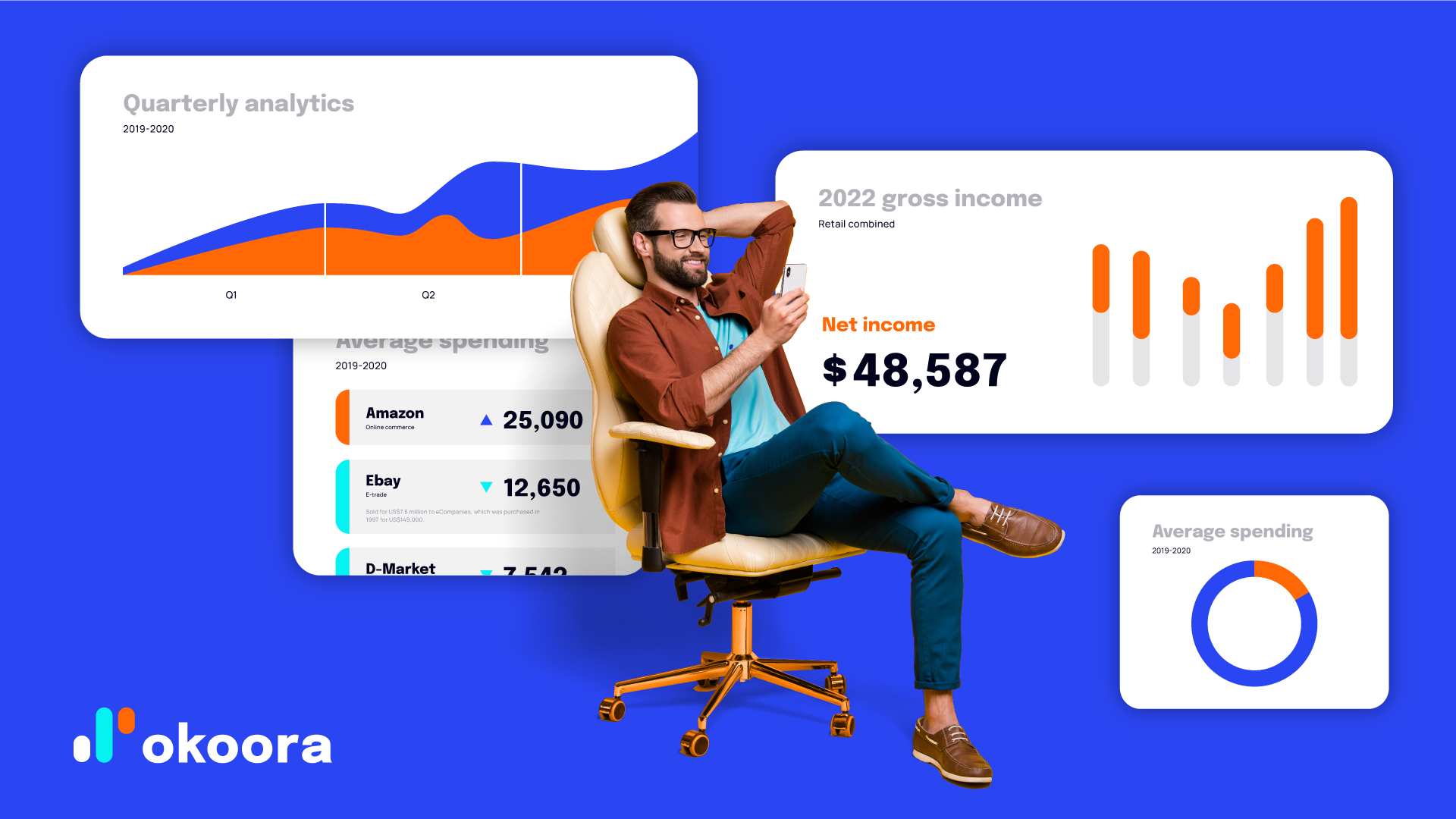
The language is schematic and simple. Color selection underlines the company’s digital nature, and its aspiration towards the future.
The blue represents intelligence and responsibility. It is cold and confident.
Blaze orange attracts the attention, delivers a feeling of life and joy. Its energy symbolizes vitality, potential for growth, brings an element of vibrancy and playfulness.
Bright turquoise grabs the attention with its peacefulness, tranquility and relaxation. It balances the vibrancy of the surrounding into one dynamic unity.
The black anchors the power and elegance of the design. It’s bold and mysterious look help create a strong and convincing appearance.


Font selection
To ensure the reliability and ease of access, two Google fonts were selected: Epilogue for headlines and Manrope for running texts.


Okoora strives to simplify the complexities of currency management, it attempts to achieve more with less. In order to achieve these goals, the design system offers an accessible, friendly and easy-to-use approach.
Okoora strives to simplify the complexities of currency management, it attempts to achieve more with less. In order to achieve these goals, the design system offers an accessible, friendly and easy-to-use approach.
The three shapes combined into one dynamic symbol, typography, color selection and layout treatment, create a balanced, energetic, and memorable appearance that help the company stand out among the competition.
